Building a More Cohesive Product Experience
Product Experience Redesign
TL;DR
One Door’s products needed a more cohesive, accessible, and intuitive experience without requiring a complete redesign of the entire platform. The challenge was to unify the interface, ensure accessibility standards are met, and simplify key workflows.
I consolidated four distinct UI styles, updated 20–30 components, and worked with Product and Sales to prioritize high-impact pages. The work improved UX consistency across ~50 pages in three product areas, reduced a six-page workflow to two pages, and gave engineers reusable components that helped them redesign 3–5 simpler pages per sprint with less design involvement.
Overview
As One Door’s product portfolio grew, the experience needed to evolve with it. The goal was to make the product feel more intuitive and approachable, with less visual clutter and and language that was familiar to retail users.
My role was to translate that vision into practical design improvements across two areas: how the interface presented information and how users navigated through the product. Collaborating with the Product and Engineering teams, I helped bring that direction to life through updates to the UI, shared components, and workflows. Together, these changes aimed to make One Door’s products feel less like separate tools and more like parts of a cohesive experience.
Certain details cannot be disclosed for confidentiality reasons. The case study will instead highlight the reasoning and approaches used throughout the project. For more information, please connect with me here.
The Challenge
Four UI styles. One product experience.
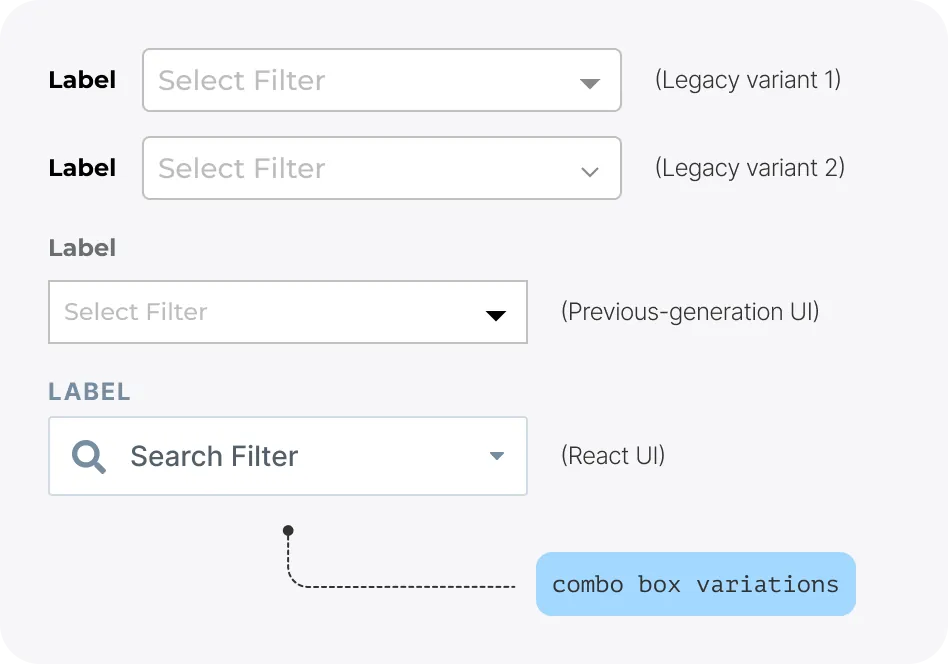
One Door had accumulated four distinct UI styles: a legacy UI, a previous-generation UI, a newer React-based UI, and a separate Store Assistant UI. Similar components varied in appearance and behaviour, leaving the Design team to navigate competing patterns and engineers to maintain multiple versions of familiar controls.
These inconsistencies also made it harder to deliver the experience leadership envisioned: a product that felt more intuitive and approachable. That direction came with specific expectations:
- Understandable at a glance: Users should grasp a page’s purpose within three seconds of landing on it.
- Less visual noise: Reduce excessive bold text and competing emphasis so important information could stand out.
- Familiar language: Replace internal One Door terminology with language used across the retail industry.
- A more approachable feel: Move away from the dense, traditional B2B software experience without sacrificing the capabilities enterprise users relied on.
These expectations had to be met within the realities of a large, complex product and a lean team. Ongoing development couldn't stop while every screen was redesigned, and accessibility requirements also needed attention.
The approach
Bringing four UI styles into one direction
How do we synchronize four distinct UIs?
Each of One Door’s four distinct UI styles had similar components that looked and behaved slighlty different across products. This created a disconnect for users and added extra work for the Design and Engineering teams to develop and maintain.
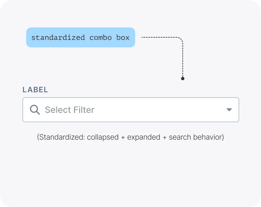
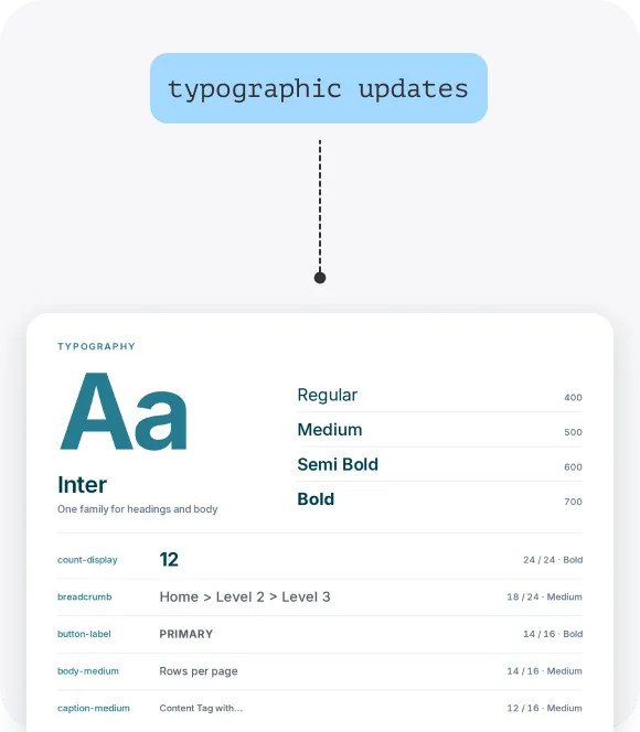
As the products’ backends were being migrated to React.js, we had an opportunity to align their interfaces with the newer React-based UI. Rather than introduce another style, I used it as the foundation for consolidating the existing patterns. I standardized typography, spacing, sizing, component states, and interactions while preserving the functionality each component needed. The goal was to create a shared UI language that could scale across the product, instead of adding to the existing mix of styles.
Making accessibility a business priority
How do we unblock client purchases?
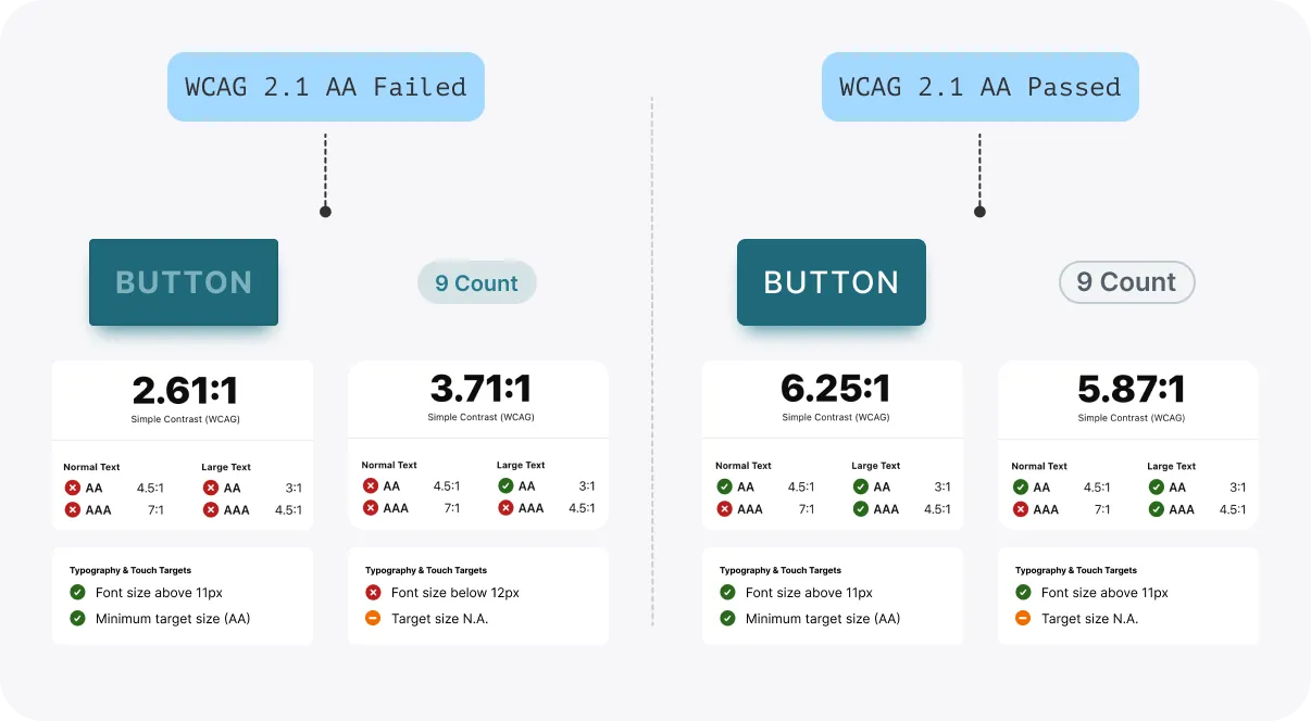
WCAG 2.1 AA compliance was a requirement for some prospective and existing clients, making accessibility important to both the user experience and sales. I updated the Figma component library to address contrast, typography, focus indicators, keyboard interactions, form validation, and other accessibility needs. The engineering team followed these designs and implemented the changes to components in Storybook.
This update helped meet client accessibility requirements, removed a compliance barrier for an existing client looking to adopt other One Door products. This also gave the design and engineering teams a shared, reusable foundation for building more accessible experiences across the product.
Making a large product feel simpler
How do we modernize a gigantic enterprise app with a skinny team?
With a lean team and a large product, we couldn’t update everything at once. I worked with the Product and Sales teams to prioritize pages that needed improvement for sales demos and areas where the Product team was introducing new functionality.
In order to meet leadership's expectations of the new visual experience, I refined typography, spacing, visual hierarchy, and interaction patterns. I also simplified how information was grouped and presented, making key actions easier to find, and workflows easier to understand and navigate. The work brought a more consistent UX/UI across 25–50 pages in three product areas, supported by 20-30 updated components.
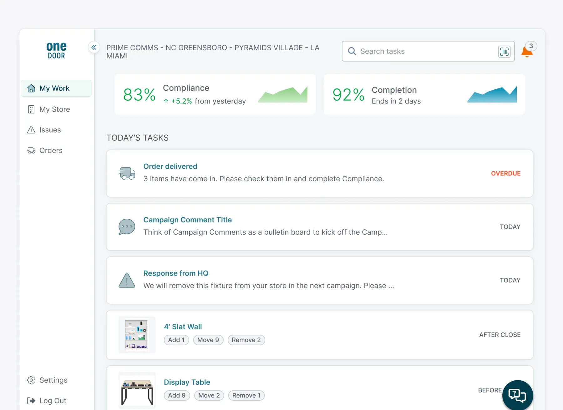
Building a foundation a lean team could extend
Alongside the Figma component library, I created design tokens to support a more scalable design system. The Engineering team built the updated components in a new Storybook branch, though the synchornization of Figma tokens and the code tokens was still pending. I reviewed the implementations against the designs to help maintain visual consistency.
The shared visual direction and reusable components enabled individual engineers to update simpler pages with straightforward layouts and interactions, without the involvement of the Design team. Engineers reported being able to redesign three to five such pages per sprint, alongside their regular tickets. This democratized the implementation of the updated experience, helping a small team apply it more efficiently across a large product without treating every page as a separate design problem.
Better UI only gets us so far
How do we improve the experience, not just the appearance?
A consistent UI was only part of the solution. I also looked at how users navigated through each workflow, where they got stuck, and what parts could be simplified. Across the selected pages, I looked for opportunities to reduce navigation, improve the information architecture, make common actions easier to find and interact with, and replaced internal terminology/jargon with clearer language.
From six pages to two
One example of the larger improvements was a planning workflow I reduced from six pages to two (which can be a case study of its own). This was one of several changes that went beyond visual updates, simplifying how users completed tasks while preserving the nuanced functionality they needed. The redesign went through several rounds of discussion with Product and other stakeholders. These conversations surfaced requirements and edge cases that led to further design iterations.
While this workflow had a particularly noticeable impact, similar opportunities were capitalized upon across other parts of the product. The shared components brought visual consistency; the workflow improvements made the product feel more standardized, simpler and efficient to use.
Results
A unified design system with real impact
1
unified design system
Consolidated four design languages into a single, consistent system across three product platforms.
Accessible by design
Updated Figma library and Storybook components to meet WCAG 2.1 AA standards.
Faster design and development
Reusable components and design tokens reduced duplication and helped teams deliver faster.
A more consistent experience
Created a cohesive look and feel across products, improving usability and consistency.
Set up for scale
Established a foundation for future product development and easier maintenance.
As the first updated pages went live, users began trying the new improvements and shared positive feedback. Many designs were complete, but several pages had not yet been implemented when my role ended. The rollout was still underway, and the design tokens had not yet been synced with the codebase. While the full vision wasn't realized during my time at One Door, the work gave the team a clearer direction and a foundation to build on.
Improving a mature enterprise product takes more than updating its visual language. It requires understanding how people work, making thoughtful decisions around the innate complexity, and creating patterns that the entire team can carry forward.