Planogramming Tool Rebuild
Modernizing a critical merchandising workflow
A strategic evolution from a legacy editor to a flexible merchandising workspace.
TL;DR
60-Second Version
Owned the end-to-end redesign of a business-critical planogramming tool, aligning customer needs, technical constraints, and leadership priorities to modernize a complex product without disrupting the workflows customers depended on.
Result: 100% client adoption, zero severe bugs in production, and a direct role in retaining a multi-million-dollar client. Plus, reusable patterns and a technical foundation that shaped the product's roadmap beyond this project.
Overview
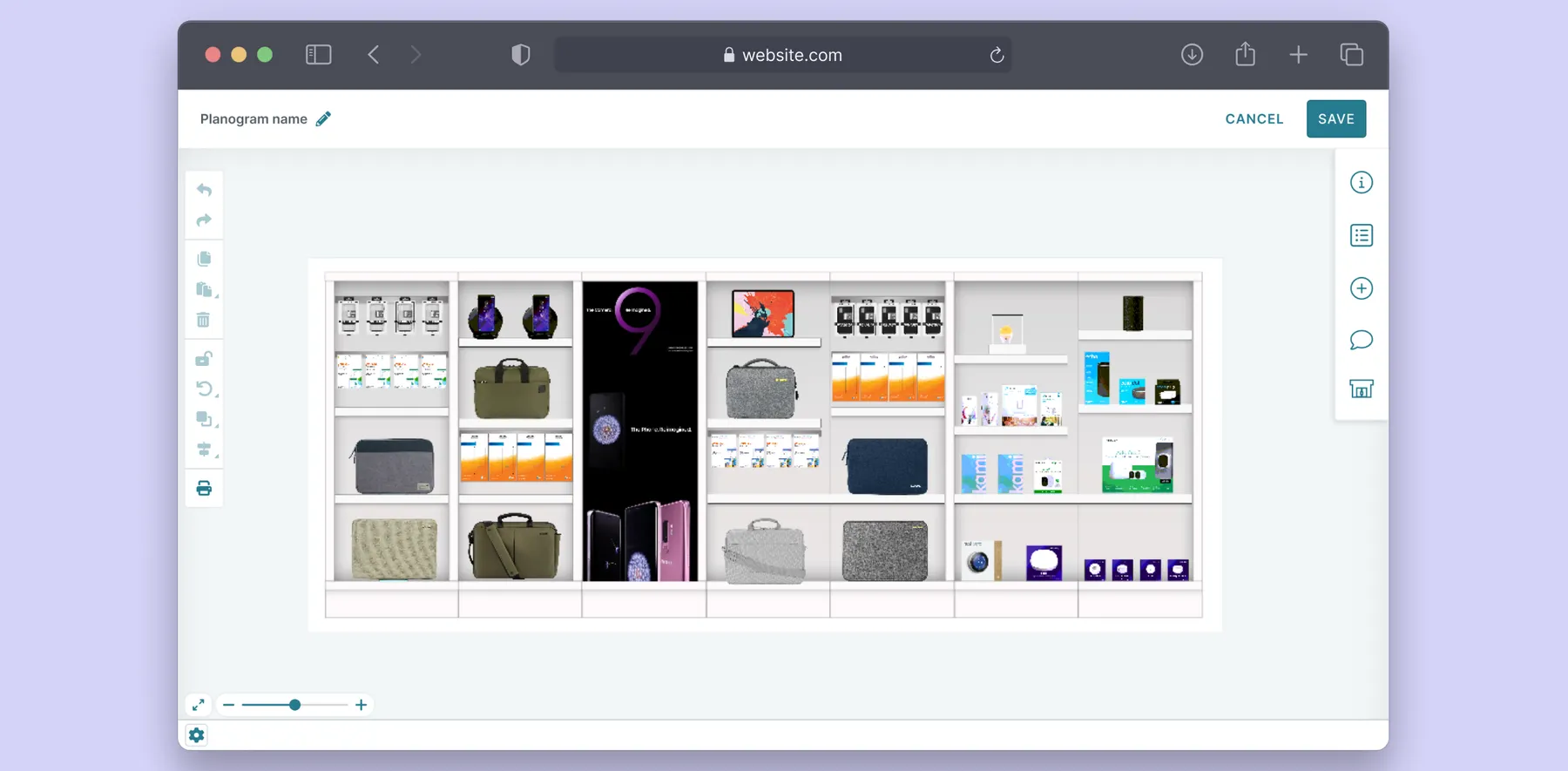
The planogramming tool is a core capability that enables clients to leverage One Door’s underlying Digital Store model. It allows visual merchandisers to create, manage, and update store merchandising plans that translate a retailer’s merchandising strategy into actionable, store-specific layouts.
I led the evolution of the planogramming tool from a legacy experience into a modern, flexible product workspace. My work spanned the core editing experience, interaction patterns, workspace configuration, and new functionality introduced throughout the rebuild.
Due to the project’s confidentiality under an NDA, certain specific details cannot be disclosed. The case study will instead highlight the methodologies and approaches used throughout the project. For more information, please connect with me here.
The Challenge
Modernize a critical workflow, while unlocking new capabilities, and laying the foundations for a stronger future product
Over time, the planogramming tool had become increasingly difficult to evolve. Its underlying technology had become outdated, performance would degrade when working with complex planograms, and the interface no longer reflected the expectations of modern users. At the same time, several customer-requested capabilities were difficult to build and maintain within the existing technical architecture.
As other One Door products gradually moved towards a new technology foundation, we saw an opportunity to rethink the planogramming tool, not just from a technical standpoint, but also from a product offering and user experience perspective.
The challenge went beyond redesigning the UI. We needed to modernize critical workflows, reduce friction in everyday tasks, unlock new capabilities, and establish a stronger foundation for future growth, both in terms of functionality and scalability.
The approach
Modernization for Adoption, Not Novelty
One of the most important insights came from our previous experience introducing significant product changes. When an experience changed too dramatically, some customers struggled with adoption and, in certain cases, preferred the previous experience despite the improvements offered by the new one. This made adoption an important design constraint throughout the rebuild.
Rather than redesigning the planogramming tool from the ground up, I took a more evolutionary approach. I preserved familiar concepts and workflows that were already working well, while introducing meaningful improvements in areas where users experienced friction. The goal was not to make the new planogramming tool work and feel entirely different, but to make it feel familiar, yet substantially better.
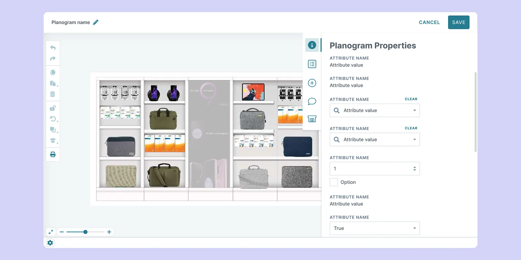
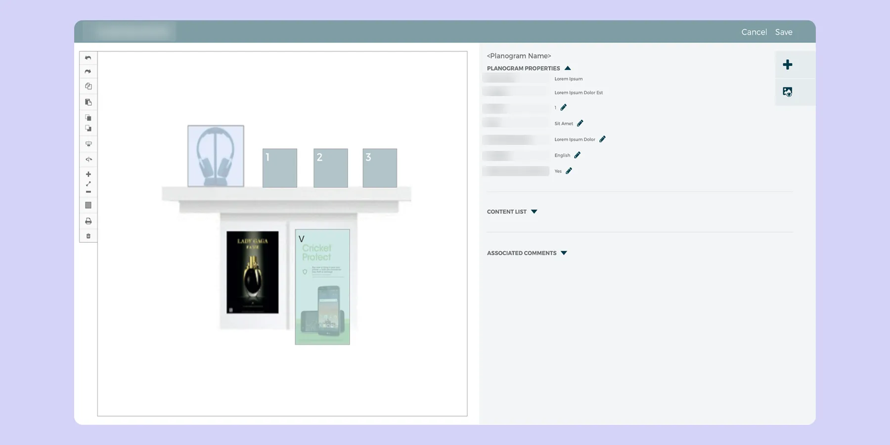
The redesigned planogramming tool introduced clearer information hierarchy, more flexible controls, a modern visual language, and new interaction patterns, while retaining the core canvas-based workflow that users already understood. This balance was intentional and helped create a sense of continuity while still moving the product experience forward.
Ultimately, redesigning a mature product is not always about maximizing visual or interaction change. It is about understanding which elements create value for existing users, identifying where change is necessary, and being equally deliberate about what should remain familiar. In this case, knowing what not to change was just as important as deciding what to improve.
Understanding the Workflow
Planogramming is one part of a much broader visual merchandising workflow. Before redesigning the planogramming experience, I wanted to understand how the planogramming task fit into our clients’ overall processes and not just how they interacted with the existing tool interface.
Because the tool had been in use for many years, there was already a substantial body of feature requests and support issues which I reviewed as a starting point. I also setup sessions to gather new feedback from our internal Customer Success and Managed Services teams. Once I had a good high-level understanding of the issues, needs, and opportunities that already existed, I started interviewing client teams about their planogramming processes. I shadowed planogrammers to gain nuanced insights into business rules, processes, and their planogramming needs.
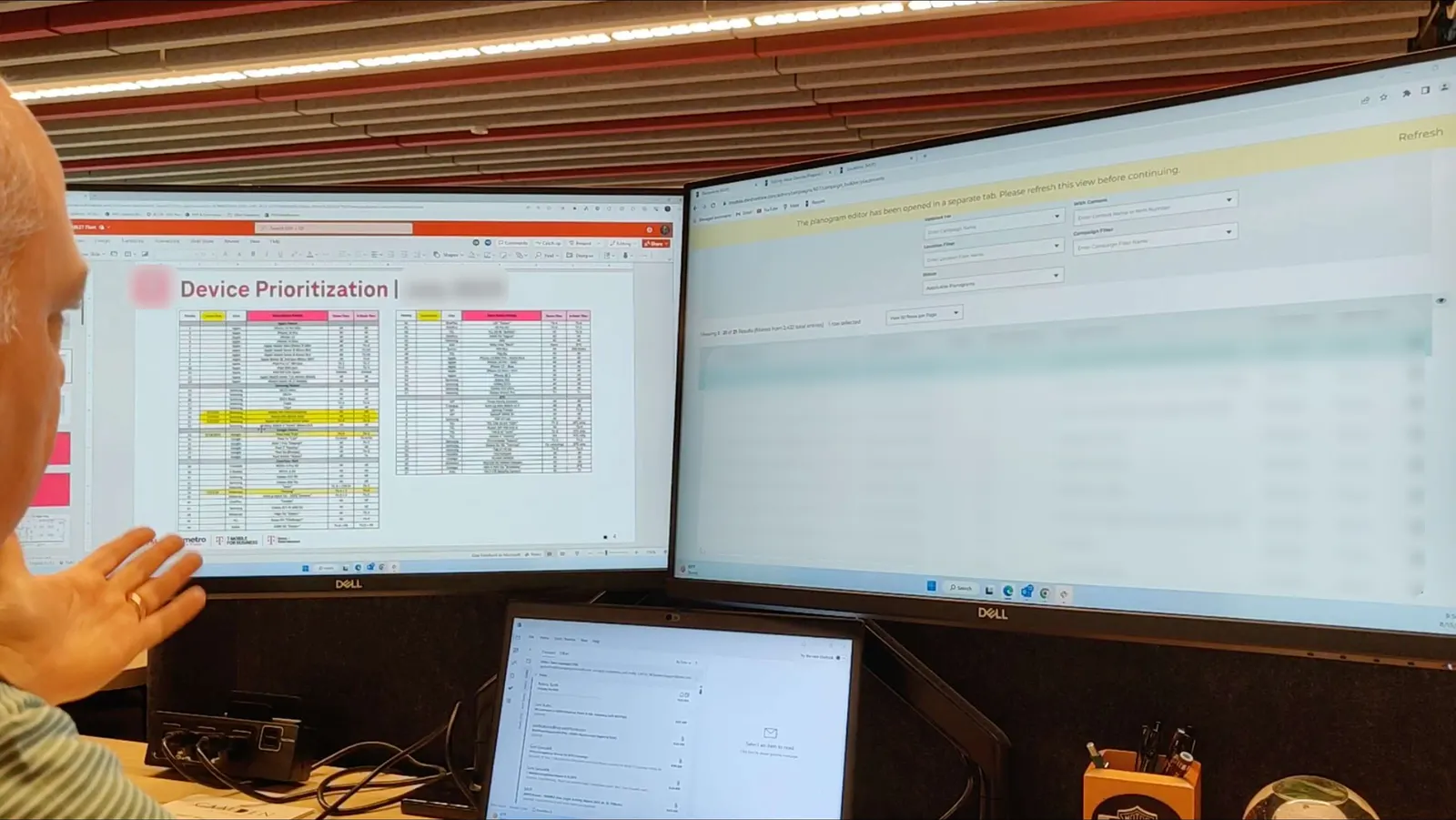
The research revealed opportunities that went beyond making just visual enhancements. Users were managing complex merchandising requirements, working with large SKU lists, and performing a lot of repetitive tasks. They needed greater flexibility and efficiency without introducing additional cognitive or interaction overhead.
These insights shaped three core design priorities:
Redesigning the canvas around the user's workflow
The canvas was central to the planogramming experience, making navigation and interaction a key focus of the redesign. As part of my research, I examined the tools users had previously used for planogramming to understand their existing mental models and expectations.
I used these insights to align the new canvas with familiar conventions from modern canvas-based products rather than introducing entirely new interaction patterns. This informed decisions around keyboard shortcuts, mouse and touchpad interactions, and more intuitive zooming, panning, and scrolling, helping make the new experience feel both modern and familiar.
Building on these insights, I redesigned several core interactions:
- Canvas navigation: More fluid and predictable zooming, panning, and scrolling interactions.
- Object manipulation: More intuitive ways to select and manipulate individual or multiple objects (SKUs, hardware, POP, etc.).
- Keyboard shortcuts: Standardized around familiar conventions to make it intuitive and reduce the learning curve.
- Paste behaviors: Newer flexible and more predictable ways to duplicate and place objects.
- Compact toolbar: Reduced visual clutter while also introducing newer capabilities.
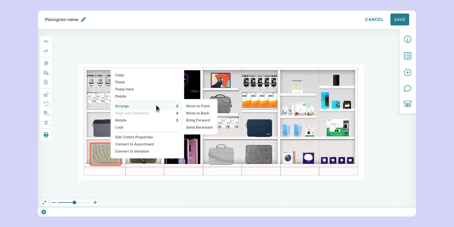
Bringing actions closer to the point of work
Planogrammers work across a wide range of screen sizes, with larger displays often requiring significant mouse travel to complete routine actions. This became particularly noticeable when users had to move all around the planogramming interface to access tools or trigger common actions.
To reduce this unnecessary movement, I introduced contextual menus that surfaced relevant actions directly within the canvas and closer to where the work was happening. This allowed users to access frequently used controls with fewer steps and less physical effort, creating a more efficient and focused workflow.
This reflected a broader principle that shaped the redesign: reduce friction by bringing relevant actions closer to the point of intent.
Making a complex workspace more flexible
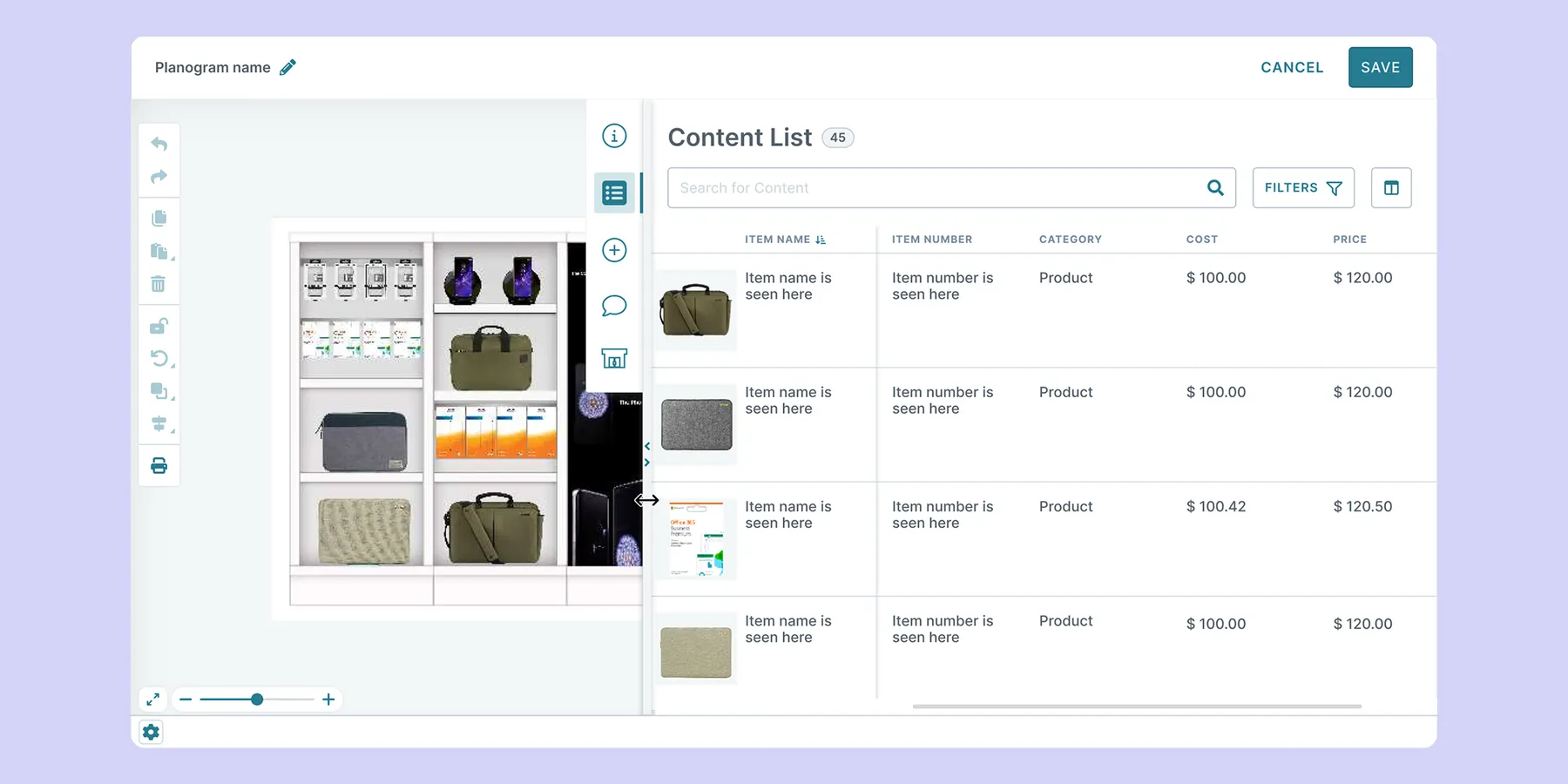
The planogramming tool needed to surface a significant amount of SKU information, but not every user needed the same information at the same time. As users moved through different stages of the planogramming lifecycle, their task priorities and information needs changed.
To accommodate these varying workflows, I introduced greater flexibility into the workspace, allowing users to customize the information and tools visible during each session. This gave users more control over their workspace and enabled them to shape the experience around the task at hand, rather than adapting their workflow to a fixed interface.
Expanding what users could accomplish
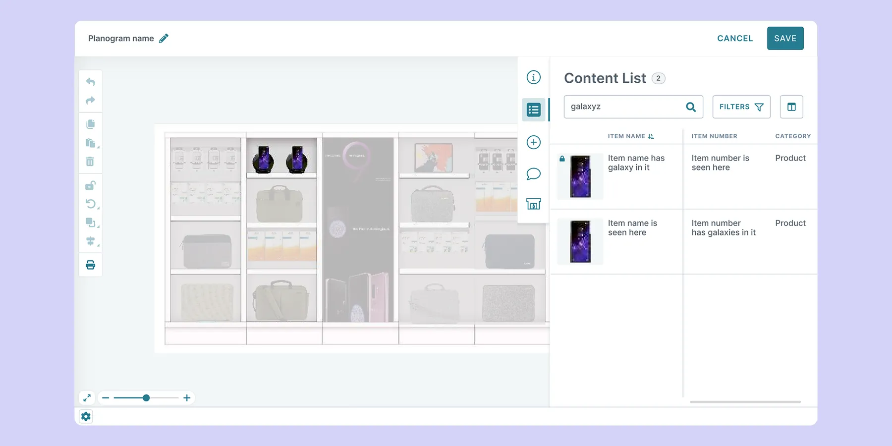
The modernized backend foundation created an opportunity to address long-standing pain points while responding to evolving user needs and previously requested features. Beyond enabling these immediate improvements, it also provided the flexibility and scalability needed to introduce new capabilities to continue enhancing the overall product experience over time.
The outcome
Faster Planogramming, Improved Trust, High Adoption & Satisfaction
The redesigned planogramming tool was successfully rolled out across the entire customer base, replacing the legacy experience. Because the organization did not have a reliable quantitative baseline for the previous planogramming tool, I instead relied on adoption, qualitative feedback, and business outcomes to provide the strongest indicators of success.
Users described the new planogramming tool as smoother, faster, and easier to use. The Managed Services team found the Add Multiple Containers capability particularly valuable, saving anywhere from 50 to 150 clicks for several clients. For one mid-sized retailer, what would have taken 200+ individual clicks became a single action. These improvements translated into more efficient day-to-day workflows without introducing additional complexity.
The launch also had a strong impact beyond the day-to-day user experience. Sales teams reported that the new planogramming tool made a strong impression during demos with prospective clients, giving them greater confidence in showcasing the product's capabilities. More importantly, the successful rollout helped maintain customer trust: the new experience was launched as a high-quality product, with no major bugs or issues reported.
The rebuild also played a significant role in retaining a multi-million-dollar client, reinforcing One Door’s value of continued investment in the product. It helped demonstrate that One Door's commitment to modernization and innovation was not simply a promise, but something clients could see reflected in the products they relied on.
Beyond the immediate improvements, moving away from the legacy foundation removed technical constraints that had previously limited the development of new capabilities. The reusable patterns and components established during the project also extended beyond the planogramming tool, contributing to the evolution of the broader product UI and providing a foundation for future product development.
The success of this project helped demonstrate my growing impact and contributed heavily to my promotion to a Senior UX/UI Designer role.
Designing beyond launch
The first release was not the end of the design process. Once the new experience was in our users’ hands, we continued to learn from real-world usage and made targeted adjustments based on emerging needs and behaviors.
For example, users began configuring additional columns as their default via the new column selector, revealing that the minimum side-panel width was too restrictive for viewing additional columns as defaults. We increased the minimum panel width to better accommodate the extra columns.
Similarly, customers discovered unexpected use cases for annotations, which made the need for smaller sized annotations more appropriate.
These iterations reinforced an important principle: the real test of a design begins once it reaches users.
What I'd do Differently
Validate technical risk earlier
One of the most challenging aspects of the project was implementing the desired canvas behavior. The interaction model I proposed created a smoother, more intuitive experience for users, but proved significantly more complex to implement than the engineering team had originally anticipated. The engineering team offered some technically simpler patterns as alternatives, but the patterns would have introduced a new point of friction to existing workflows.
I worked closely with Engineering to understand the technical trade-offs, evaluate alternative solutions, and advocate for the interaction model that best supported the user workflow. This required balancing four considerations:
- User experience: Would the interaction remain intuitive?
- Technical feasibility: Could it be implemented reliably and quickly?
- Delivery: What impact would the approach have on timelines and resources?
- Product value: Was the improved experience worth the additional complexity?
When timelines came under scrutiny, I communicated these trade-offs directly to leadership and advocated for protecting the core experience rather than optimizing solely for implementation speed.
In hindsight, I would advocate for a focused technical proof of concept earlier in the process. Testing the most complex interactions upfront could have surfaced technical constraints sooner, reducing rework and delivery risks.
This experience marked a shift in my role as a designer. I wasn't just delivering designs, I was helping the team make informed product decisions where UX, technology, and business priorities intersected.
Plan for change, not certainty
We also experimented with new ways to manage the project via structured swimlanes and workstreams to help the engineering team coordinate parallel efforts across the project. While this provided an initial framework for organizing work, shifting dependencies, vacation time, sick days, and delivery timelines introduced additional planning overhead and made the structure harder to maintain as the project evolved.
Today, I would favor a more flexible approach that provides structure while allowing teams to adapt ownership and priorities as work progresses. Rather than dividing work across multiple streams, engineers could take greater end-to-end ownership of defined product areas, reducing handoffs and simplifying dependencies.
AI-assisted development also makes this approach increasingly viable. The key lesson for me was that project structure should enable flexibility and collaboration without becoming a constraint in itself.